STORY: 1970 vs 2016
There has been a general pattern of terror attacks happening around the world that the number of people killed due to terrorism increases gradually as time passes by. Especially, compared to 1970, 2016 is much more dangerous and difficult for innocent people to avoid terror attacks because terror attacks are ubiquitous and armed with more destructive, weapons which enable terrorists to kill more people easily and without a hassle. The story here is trying to tell how terror attacks are different from 1970 to 2016.
"Hell is empty and all the devils are here" - Shakespeare
1. Plotly, geo-temporal map

The map is created with a slider function built in Plotly to show how the geolocations of terror attacks in 1970 are different from those of the terror attacks in 2016. The slider consists of two years, 1970 and 2016. A blue circle represents a terrorist attack with a tooltip that shows much information of the attack and the size of the circle means the number of people killed in the attack. An interesting observation is that as year goes by, the number of terrorist attacks increases with an increase in the casualty of the attacks as well.
The code and the dataset: Click Here
2. R, leaflet

The map of US is created using Leaflet in R to show how the geolocations of terror attacks happened on the US soil in 1970 are different from those of 2016, compared to the world. The green dot represents an terror attack occurred in 1970, whereas the red dot represents an terror attack occurred in 2016 on the map, where 1970 and 2016 are added as an user option on the upper-right hand corner of the map. An interesting observation is that fewer numbers of terror attacks happened on the US in 2016 than in 1970.
The code and the dataset: Click Here
3. Plotly, bargraph

The bar graph is created using Plotly in python to show how the numbers of deaths by the different means of terror attacks change from 1970 to 2016. In the visual, the yellow color represents 2016 and the blue color represents 1970. An important fact is that bombing/explosion is the popular means of terror attacks to target and kill people regardless whether it is 1970 and 2016. In 2016, the number of deaths due to terrorism in 2016 is extraordinary compared to that of deaths in 1970; the yellow color completely dominates the number of killed in each category in the x-axis.
The code and the dataset: Click Here
4. Plotly, heatmap
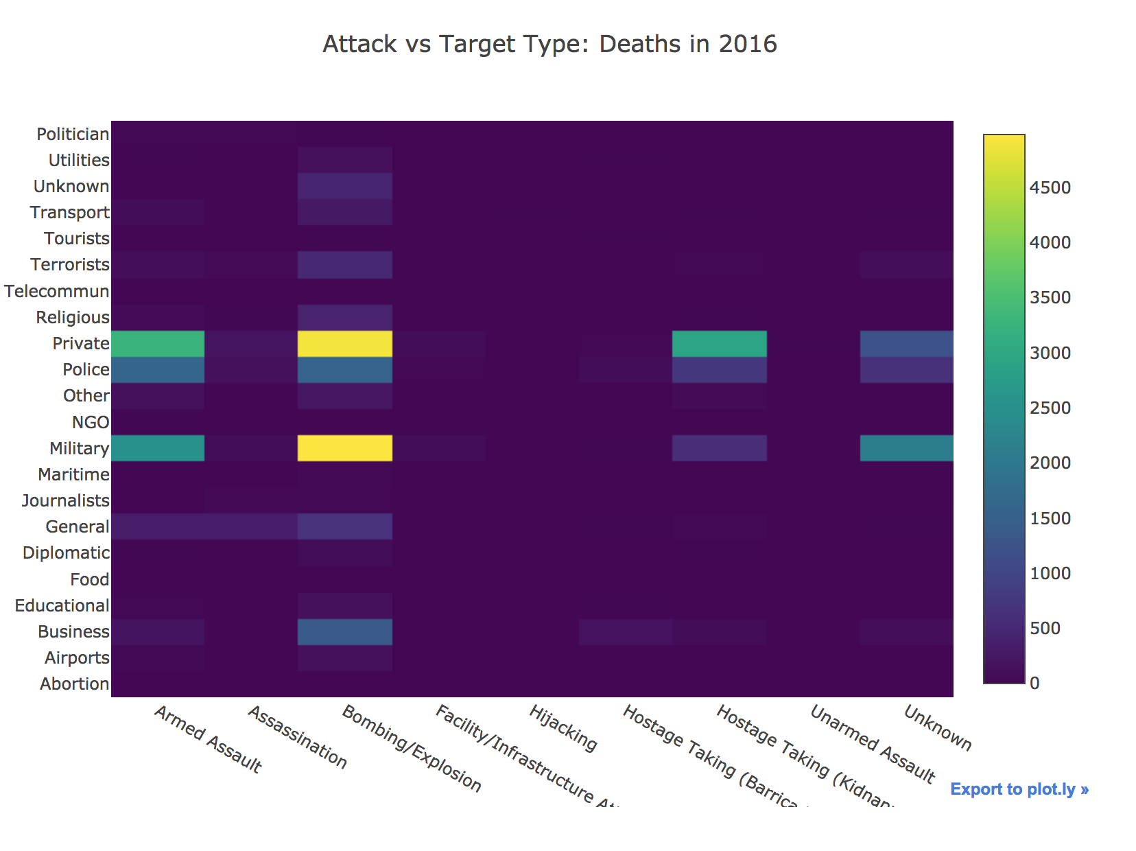
As seen above, the number of deaths due to terrorism in 2016 is absolutely overwhelming. This heatmap of the death counts due to terrorism in 2016 is produced using Plotly to examine the number of deaths by attack and target types of terrorism further in 2016. In the visual, x represents the list of the attack types of the terror attacks, y represents the list of the target types of the terror attacks, and z represents the number of deaths by both the attack and target types. It clearly seems that there were many deaths, especially targeted at private citizens and military personnel by the popular means of terror attack, bombing.
The code and the dataset: Click Here
5. Plotly, temporal line graph

The line graph on the left shows temporal changes in the numbers of deaths due to terrorism over 1970 and 2016. On the left of the visual, the blue color represents 1970 and the yellow color represents 2016. The y-axes of the two subplots are different from each other because the number of deaths in 1970 is extraordinarily smaller than the number of deaths in 2016. The y-axes are adjusted to accommodate the difference whereas the x-axes of the both subplots mean months, from January to December. It is clearly seen that the number of deaths in 1970 tends to decrease as the months goes by but in 2016, it is hard to say there is a temporal pattern in the number of deaths.
The code and the dataset: Click Here
6. Tableau, bubble

The bubble chart is created using Tableau to simplify for an audience to observe where terror attacks occurred the most in 1970 and 2016. The size of a bubble represents the number of deaths; the bigger the size is, the higher the number of deaths is. An interesting observation is that more attacks occurred more globally in 2016 than in 197 0.
The code and the dataset: Click Here
7. Tableau, map

The map created by Tableau is to show how severe terrorist attacks are a threat to Iraqi people in 2016. The size of a circle represents the number of deaths; the bigger the size is, the higher the number of deaths is. Based on the visual created, lots of deaths occurred around Baghdad.
The code and the dataset: Click Here
8. NetworkD3, network

The network is generated by using NetworkD3 package in R to display the relationship between the locations of terror attacks and the nationalities of terrorist targets. The network only represents 1970 and 2016. An interesting observation is that Greece and Egypt have an adverse relationship that an edge between them is very thick, which tells that there have been many terror attacks happened in the both locations targeting each other.
The code and the dataset: Click Here
9. Plotly, pie
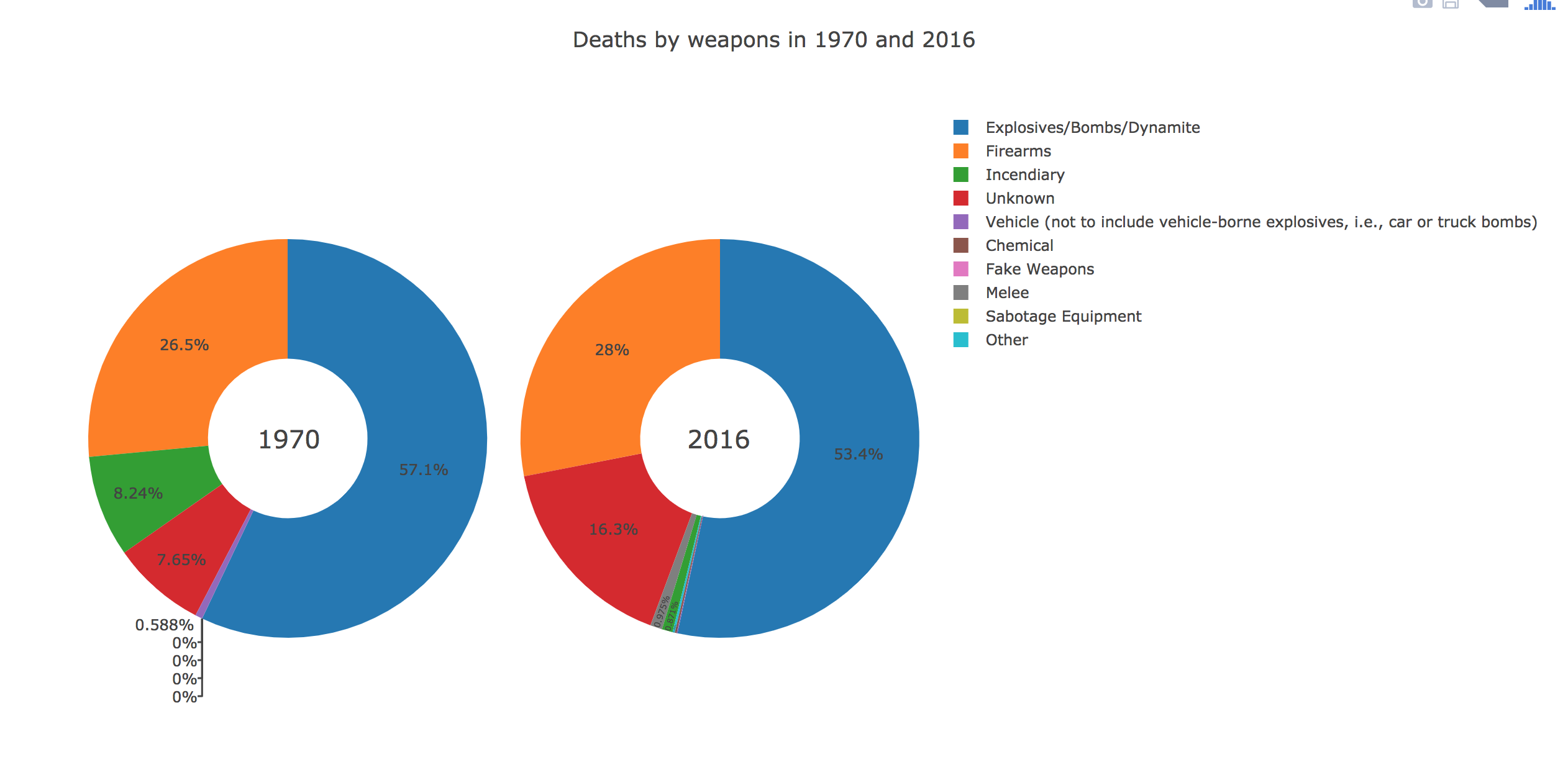
The pie is generated by using Plotly in python to display the pie charts of the percentages of deaths by each type of weapons used in terrorism for 1970 and 2016. An interesting observation is that incendiary is the third most commonly used means of the terror attacks in 1970 but it is not used much by terrorists in 2016.
The code and the dataset: Click Here
10. Plotly, dot

Finally, the dot plot on the left is created to display the distributions of different database sources of terror attacks occurred around the world in 1970 and 2016. It is interesting to see that different database sources were used to collect the information of the terror attacks in 1970 but only one source was used to collect the information of the terror attacks in 2016. Since the multiple database sources were used in 1970, the integrity and thoroughness of the data are questionable.
The code and the dataset: Click Here