1. Plotly, Interactive

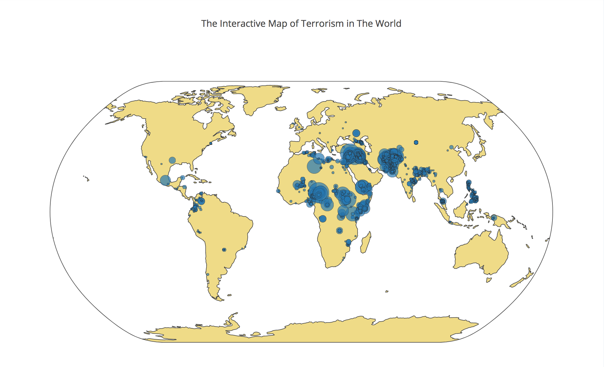
The visualization is created using Plotly to display the map of terrorist attacks occurred around the world since 2010. The interactive map is created with a slider function built in Plotly and each move in the slider function adds one year to 2010. A blue circle represents a terrorist attack with a tooltip that shows much information of the attack and the size of the circle means the number of people killed in the attack. An interesting observation is that as year goes by, the number of terrorist attacks increases with an increase in the magnitude of the attacks as well, meaning higher casualty. Also, according to the map, terror attacks has no boundaries in the world; they happened almost everywhere regardless of geographical limitation.
The code and the dataset: Click Here
2. Plotly, Interactive

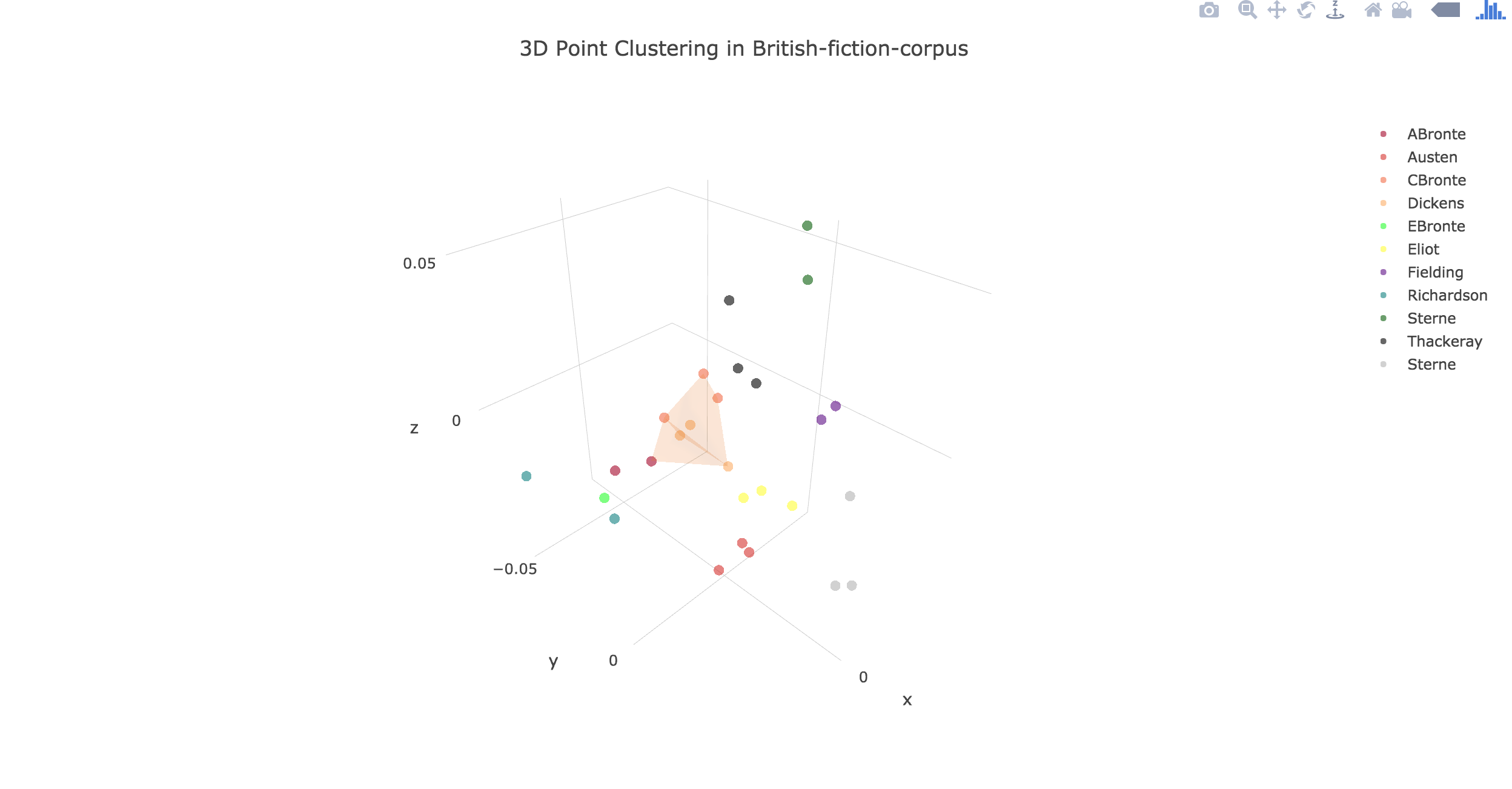
The visualization is generated using Plotly to show a 3D-clustering group among the British fiction corpus in a three dimensional space. Euclidean distance and cosine similarity are computed to map to 3-dimensions and the alpha-shape algorithm is used to form a shape of the cluster among the British fiction corpus. In the center of the visual, a cluster is clearly seen among Charlotte Bronte, Dickens, and Anne Bronte, suggesting that they are very close, textually similar, to each other in terms of cosine similarity distance.
The code and the dataset: Click Here