1. ggplot2, Non-Interactive
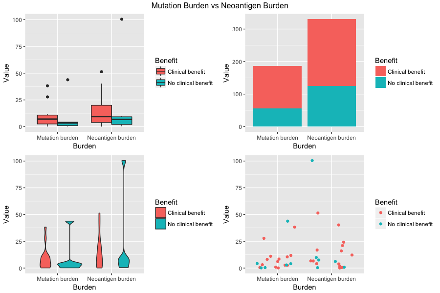
The visualization is created in ggplot2 in R to compare mutation burden and neoantigen burden in whether they are clinically beneficial or not. Four different subplots using different visualization techniques are created on the same data. According to the boxplot in the upper left corner, it is probable to have a conclusion that neoantigen burden is more clinically beneficial than mutation burden because the middle 50% of neoantigen burden has larger clinical benefit values than the middle 50% of mutation burden has.
The code and the dataset: Click Here
2. ggplot2, Non-Interactive
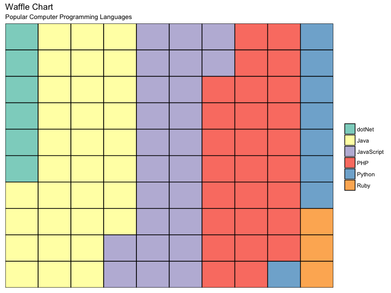
The visualization is generated using ggplot2 in R to display the frequency distribution of popular computer programming languages captured in a dataset using a chart method called waffle chart. A waffle chart consists of 100 boxes in a big square frame and each colored box represents a computer programming language. According to the visual on the left, the most commonly used computer programming language is Java followed by PHP.
The code and the dataset: Click Here